
Sister Mary, a new strategic design agency founded by Leigh Chandler, has unveiled the design for a limited-edition run of intricately designed votive candles. The client? Leigh herself.
Leigh, whose 20 year career has seen her design for major brands including Baileys and Guinness, says: “If you’re going to start your own agency, you might as well start off by giving yourself your dream brief.”
So that’s what she did: commission herself to create a beautiful artifact that represents her studio, her personal style, and her ambition to be a beacon of change in the design industry.
We spoke to Leigh to discuss not only the project but what her new agency stands for and what it hopes to achieve in the coming years.
What was the brief?
Founding Sister Mary, a new strategic design agency, was one of the most important creative decisions I’ve ever made.
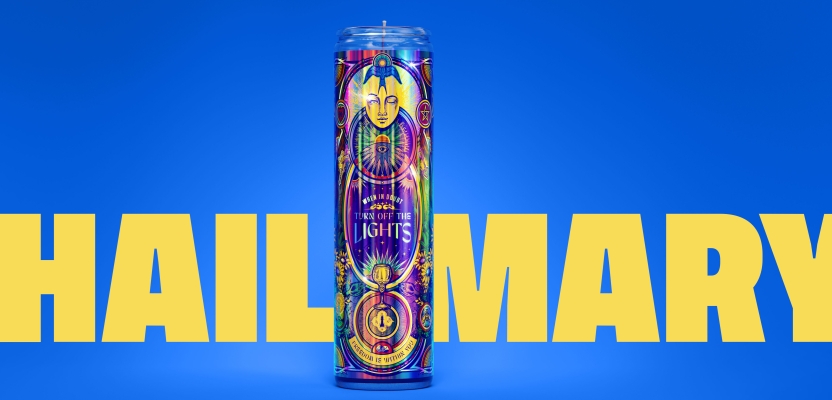
To honor this new start, and to double down on what running my own agency means to me, I commissioned myself to create my dream brief: a a beautiful object that celebrates maximalism, ties into the tongue-in-cheek spiritual iconography present in my studio brand, and captures my commitment to the power of art and the beauty of ideas.
The result is a limited run of custom votive candles for friends, clients and collaborators.
How did the initial pitch/brainstorming phase go?
I went in knowing I wanted to create something unique to really show off my creative vision for Sister Mary, something that would represent the kind of work I love doing. Inspiration first arrived one morning when I was in my local bodega.
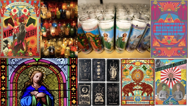
Walking past the shelf of candles, it clicked: here’s an ordinary object with such creative potential, and it just so happens to tie thematically into the tongue-in-cheek religious motifs I’ve peppered into the Sister Mary brand.
I brought in the illustrator Graham Erwin to collaborate with me on this project, and I’m so proud of the time we spent researching symbolism and meaning. With some projects, time is a luxury but I’m a firm believer in taking the time to ensure that every single detail has meaning and a thought behind it. Being my own client allowed me to take that even further: Graham and I left no stone unturned in our exploratory phase.
Describe the purpose of the project and its target audience
I have spent my career helping brands turn their packaging into beautiful objects that convey meaning to their customers. This was my opportunity to create a beautiful object that would honor and elevate my own business to my peers and ideal clients. It was such an exciting, and meaningful, creative challenge to embark on.
What was your thinking behind the project?
The ‘big idea’ is Beacon of Change. Sister Mary is standing for equality in creative ownership of agencies. Our ethos and way of operating is different to other agencies. Our way of working and creative output is disruptive and unique. We wanted this candle to signify that. I also wanted the candles to be rich and multi-layered in terms of storytelling,
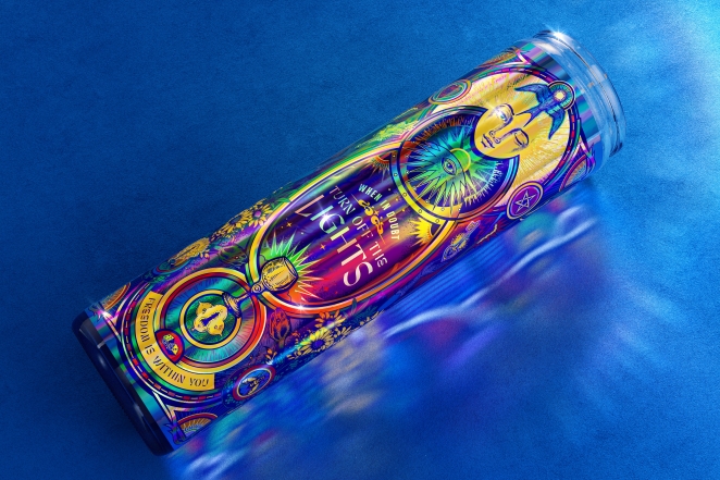
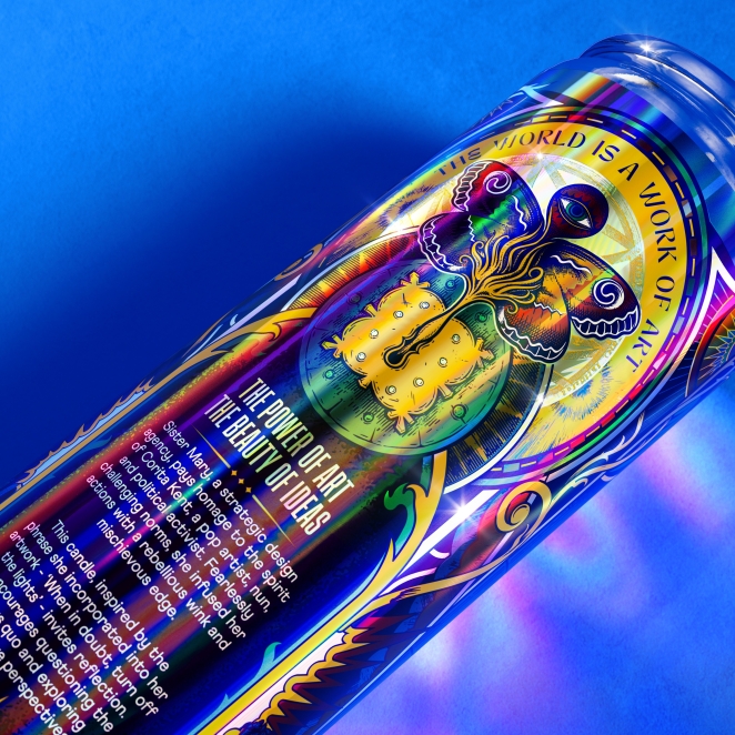
Several phrases are incorporated into the design, all inspired by works of SIster Mary Corita Kent. ‘When in doubt turn off the lights’ is a play on the subject matter as well as a call to take time to reflect and look inward for inspiration if you ever feel overwhelmed / uninspired.
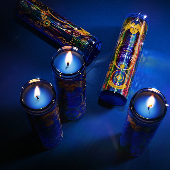
I also wanted the candles to be rich and multi-layered in terms of storytelling. An avid opponent of “blanding,” I saw the candle design as an opportunity to show off my maximalist, expressive design style through rich symbolism that told my story while also harkening back to artistic traditions that have always inspired me.
Easter-eggs that are unique and personal to both myself and Sister Mary are sprinkled through the final design: a lit joint disguised as a candle and subtle marijuana leaves climbing up the side of the label are nods to my experience designing for cannabis brands and recent stint as a judge for the Cannabis Clio Awards; an occultic Pentacle design represents a tarot reading that I received whilst deciding whether or not to found Sister Mary; and sunflowers, symbols of longevity, represent the kind of lasting relationship I hope to have with dream clients.
Did you learn anything new during the project?
I learned how rewarding it is to create work for myself. For so many years I have created beautiful work for brands and clients, but this was the first time in a LONG time that I created work purely for myself. It also required a great deal of introspection which I found incredibly valuable when starting on this journey as a new agency founder. To determine my beliefs, values, vision, and have fun along the way.
What was the biggest challenge? How did you overcome it?
Being a self-initiated project, there were no real strategic or design challenges. We had the luxury of being our own clients!
What kit/tools/software were used to create it?
Imagery was manipulated in Adobe Photoshop, and the artwork was finalized in Adobe Illustrator ensuring production was easy and the artwork can be scaled and adapted for future uses. The labels were digitally printed using four color process on holographic film, with varying transparencies of white added to create depth and contrast between transparent and opaque areas.
What details are you most proud of and why?
The most unique aspect of the design is how layered and rich it is in terms of storytelling. Some references are biblical, some inspired by Tarot, and some by the broader world of the mystic.
Graham and I have a shared love of ancient symbolism and it was a struggle to edit down our selection - we wanted to incorporate everything! I did wonder at one stage if it was ‘right’ to combine references from such wildly different places. But this is our time to make the rules.
What visual influences fuelled your solution?
My PERSONAL taste is very much more is more is more. I’m anti-blanding, and therefore I wanted the candles to be vibrant and maximalist. Graham and I pulled references from the psychedelic era along with some more recent references - but we were very keen to create something truly unique that didn’t fall into current trends.
If anything, during the moodboard stage our main filter was ‘have I seen something like that before? Yes? OK it’s not right.’ Beacon of Change was our guiding thought - we wanted to build something disruptive, compelling, arresting, optimistic and inspiring. All characteristics of what we are building with Sister Mary.
What do you hope it achieves for the brand?
I hope it communicates the brave, bold and mischievous personality of the Sister Mary brand we are building. I also hope it showcases to potential clients how thoughtful we are when approaching a creative brief, and demonstrates the type of work we love to do.
What would you do differently if you could do it over again?
I would have LOVED to create the labels with completely transparent areas so that when the candle burned down it turned into a stained glass window, which was the original inspiration.
But being a young studio we had to be mindful of the budget for production, and ultimately the printers did an incredible job to work within the budget we set.
Credit list for the work?
Creative Director - Leigh Chandler
Illustrator - Graham Erwin
Visualization - Nik Ainley